
Extjs--12种布局方式
按照Extjs的4.1的文档来看,extjs的布局方式大致有12种,下面一一介绍,有些代码就是文档中的。
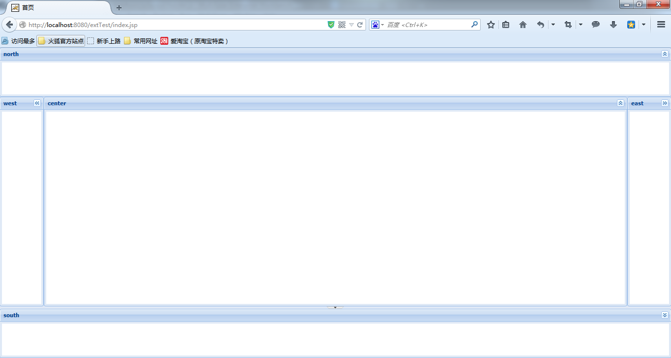
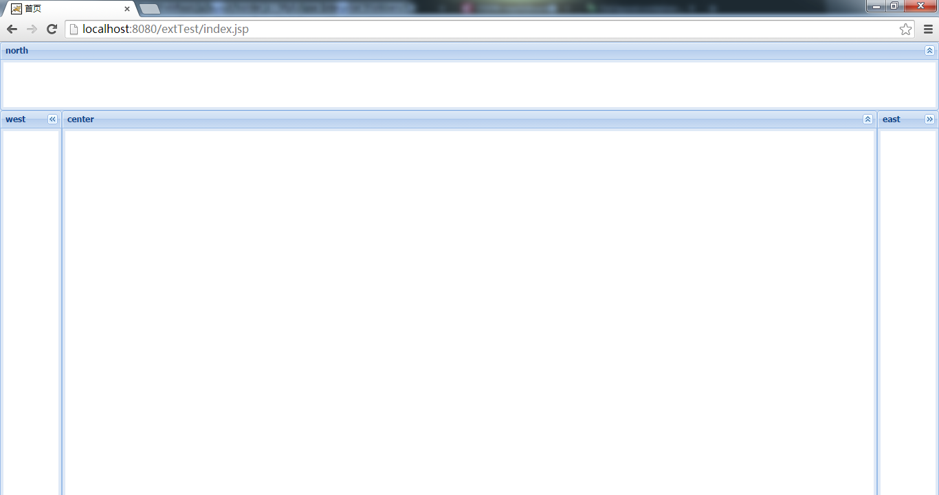
1.Border 边界布局
border布局,最多可以将页面分割为“东南西北中”五部分,是最常用的一种布局方式。我们可以根据项目的实际需求保留其中的部分区域,而将其他部分隐藏掉。
1.1效果图预览
1.2 代码demo
Ext.onReady(function () {
          //border布局 最多可将页面划分为5个区域
          //使用Viewport容器 可自适应页面窗口大小
          //一个页面只可有一个viewport
           new Ext.Viewport({
                title: "border layout",
                layout: "border",
                defaults: {
                    bodyStyle: "background-color: #FFFFFF;",
                    frame: true
                },
                items: [
                        //collapsible:是否可折叠
                        { region: "west", width:90, title: "west", collapsible: true },
                        { region: "east", width: 90, title: "east", collapsible: true },
                        { region: "north", height: 100, title:"north" , collapsible:true },
                        { region: "center", split: true, border: true, collapsible: true,title:"center" },
                        { region: "south", title:"south", split: true, border: true, collapsible: true, height: 100 },

                        ]
            });
});
1.3 关注点
a.north和south区域需要指定高度height,west和east区域需要指定宽度width。
b.尽管当不包含center组件时,页面并不会由于语法错误而无法显示,但页面中会有一部分区域空出来。所以在使用border布局时,必须要定义其center区域。
c.center域不必赋予其宽度和高度,即使你定义了其宽高也不会有任何效果;当其他区域未定义比如south,center域会自动填充空出来的部分,如下图:
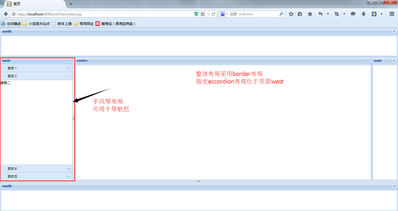
2.accordion 手风琴布局【可折叠布局】
可折叠的accordion通常被用来作为导航栏或一级菜单来使用,手风琴的每个title定义为一级菜单,在其面板上定义菜单树,就是一个完整的导航了。
2.1 预览
2.2代码demo
Ext.onReady(function () {
            //定义手风琴布局
            var accordion = Ext.create("Ext.panel.Panel", {
                title: "west",
                layout: "accordion",  //设置为手风琴布局
                layoutConfig: {
                    animate: true
                },
                width: 250,
                minWidth: 90,
                region: "west", //设置方位 位于border布局的west
                split: true,
                collapsible: true,
                items: [
                            { title: "面板一", html: "面板一", iconCls: "save" },
                            { title: "面板二", html: "面板二", iconCls: "search" },
                            { title: "面板三", html: "面板三", iconCls: "back" },
                            { title: "面板四", html: "面板四", iconCls: "12" }
                       ]
            });
            //整体布局采用border
            new Ext.Viewport({
                title: "Viewport",
                layout: "border", //这里是(border)边界布局
                defaults: {
                    bodyStyle: "background-color: #FFFFFF;",
                    frame: true
                },
                items: [
                             accordion, //这里是(accordion)手风琴布局
                            {region: "east", width: 90, title: "east", collapsible: true },
                            { region: "north", height: 100, title: "north", collapsible: true },
                            { region: "center", split: true, border: true, collapsible: true, title: "center" },
                            { region: "south", title: "south", split: true, border: true, collapsible: true, height: 100 }
                        ]
            });
        });
2.3 关注点
a.只有 Ext的各种Panel和Ext.panel.Panel的子类可以用于这种布局的容器中.
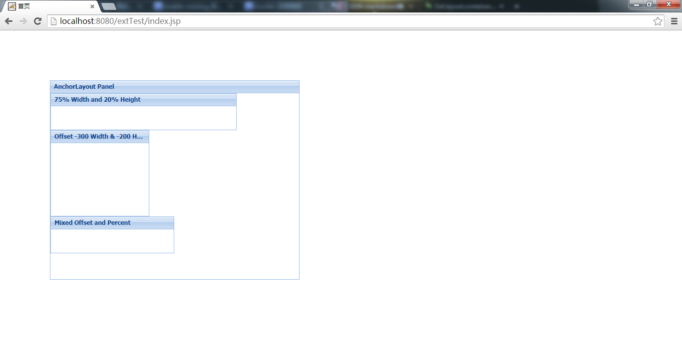
3.Anchor 锚点布局
锚点布局将子元素与父容器绑定到了一块,当父容器大小发生改变时,所有固定的子项将按各自的anchor 规则自动被重新渲染固定.
3.1 预览图
3.2 代码demo
Ext.onReady(function(){
        //锚点布局
        //容器内子项通过比例布局
        //若容器大小改变 子元素等比缩放
     Ext.application({
         name: "anchor",
         launch: function () {
             Ext.create("Ext.Panel", {
                width: 500,
                height: 400,
                title: "AnchorLayout Panel",
                layout: "anchor",
                x:100,
                y:100,
                renderTo: Ext.getBody(),
                items: [
                    {
                        xtype: "panel",
                        title: "75% Width and 20% Height",
                        anchor: "75% 20%"
                    },
                    {
                        xtype: "panel",
                        title: "Offset -300 Width & -200 Height",
                        anchor: "-300 -200"
                    },
                    {
                        xtype: "panel",
                        title: "Mixed Offset and Percent",
                        anchor: "-250 20%"
                    }
                ]
            });


         }});


});
3.3 关注点
a.上述代码中anchor属性有三种写法
一、anchor: ‘75% 20%’ 子元素宽度为容器的75%,高度为20%
二、 anchor: ‘-300 -200’ 子元素距离容器右边距300,底部200
三、anchor: ‘-250 20%’ 混合模式 子元素距离右边250,高度为20%
b.xtype用来定义子元素的类型
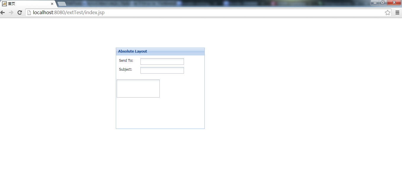
4.Absolute 绝对布局
Absolute布局继承自anchor,但是absolute是使用标准的x,y来定义子元素的坐标,所以当父容器大小改变时,子元素不会随之变化。
4.1 预览图
4.2代码demo
Ext.onReady(function(){
       //绝对布局
       //通过指定坐标来布局
       //由于指定了坐标 无法自适应
     Ext.application({
         name: "absolute",
         launch: function () {
                Ext.create("Ext.form.Panel", {
                    title: "Absolute Layout",
                    width: 300,
                    height: 275,
                    x:400,
                    y:100,
                    layout: {
                        type: "absolute"
                    },
                    url:"save-form.php",
                    defaultType: "textfield",
                    items: [{
                        x: 10,
                        y: 10,
                        xtype:"label",
                        text: "Send To:"
                    },{
                        x: 80,
                        y: 10,
                        name: "to",
                      //  anchor:"90%"  // anchor width by percentage
                    },{
                        x: 10,
                        y: 40,
                        xtype:"label",
                        text: "Subject:"
                    },{
                        x: 80,
                        y: 40,
                        name: "subject",
                    //    anchor: "90%"  // anchor width by percentage
                    },{
                        x:0,
                        y: 80,
                        xtype: "textareafield",
                        name: "msg",
                     //   anchor: "100% 100%"  // anchor width and height
                    }],
                    renderTo: Ext.getBody()
                });


         }});

});
4.3 关注点
a.上面代码的预览中,如果改变父容器的大小,子元素不会随着变化,但有时我们既想使用坐标来定位,又希望子元素随容器变化,这时可以使用anchor属性,你可以去掉代码中的相关注释试试看。由于absolute是继承自anchor的,所有可以使用该属性。
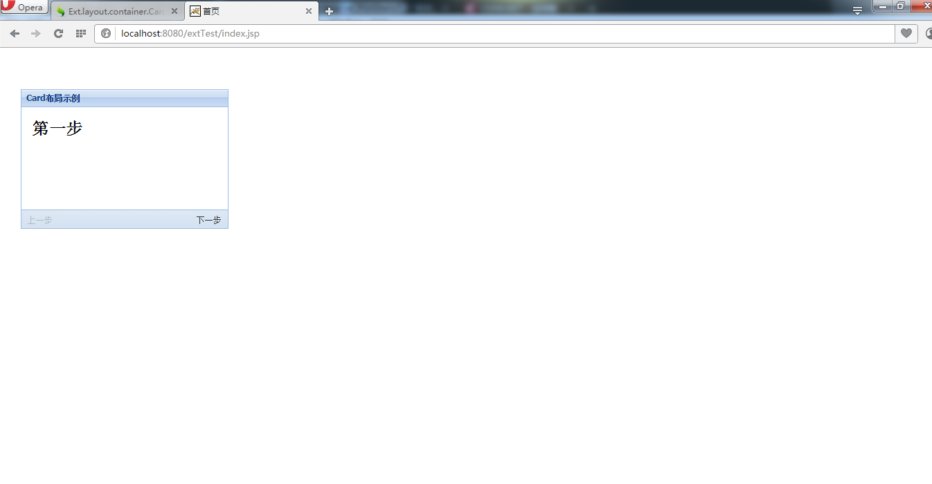
5.Card 卡片布局
card管理多个子组件, 每个都完全填满父容器, 而每次仅显示一个. 此布局样式多用于向导, 实现标签页布局等等
5.1 效果图预览

5.2 代码demo
Ext.onReady(function(){
//卡片布局 可以定义多个卡片 但每次只显示一个
//可以通过setActiveItem指定
//常用来做向导、分步提交
Ext.application({
name: "card",
launch: function () {
var navigate = function (panel, direction) {
var layout = panel.getLayout();
layout[direction]();
Ext.getCmp("move-prev").setDisabled(!layout.getPrev());
Ext.getCmp("move-next").setDisabled(!layout.getNext());
};
Ext.create("Ext.panel.Panel", {
title: "Card布局示例",
width: 300,
height: 202,
layout: "card",
activeItem: 0, //默认显示的card 从0号开始
x: 30,
y: 60,
bodyStyle: "padding:15px",
defaults: { border: false },
//bbar 底部工具栏 tbar顶部工具栏
bbar: [{
id: "move-prev",
text: "上一步",
handler: function (btn) {
navigate(btn.up("panel"), "prev");
},
disabled: true
},
"->",
{
id: "move-next",
text: "下一步",
handler: function (btn) {
navigate(btn.up("panel"), "next");
}
}],
items: [{
id: "card-0",
html: "<h1>第一步</h1>"
},
{
id: "card-1",
html: "<h1>第二步</h1>"
},
{
id: "card-2",
html: "<h1>最后一步</h1>"
}],
renderTo: Ext.getBody()
});
}
});
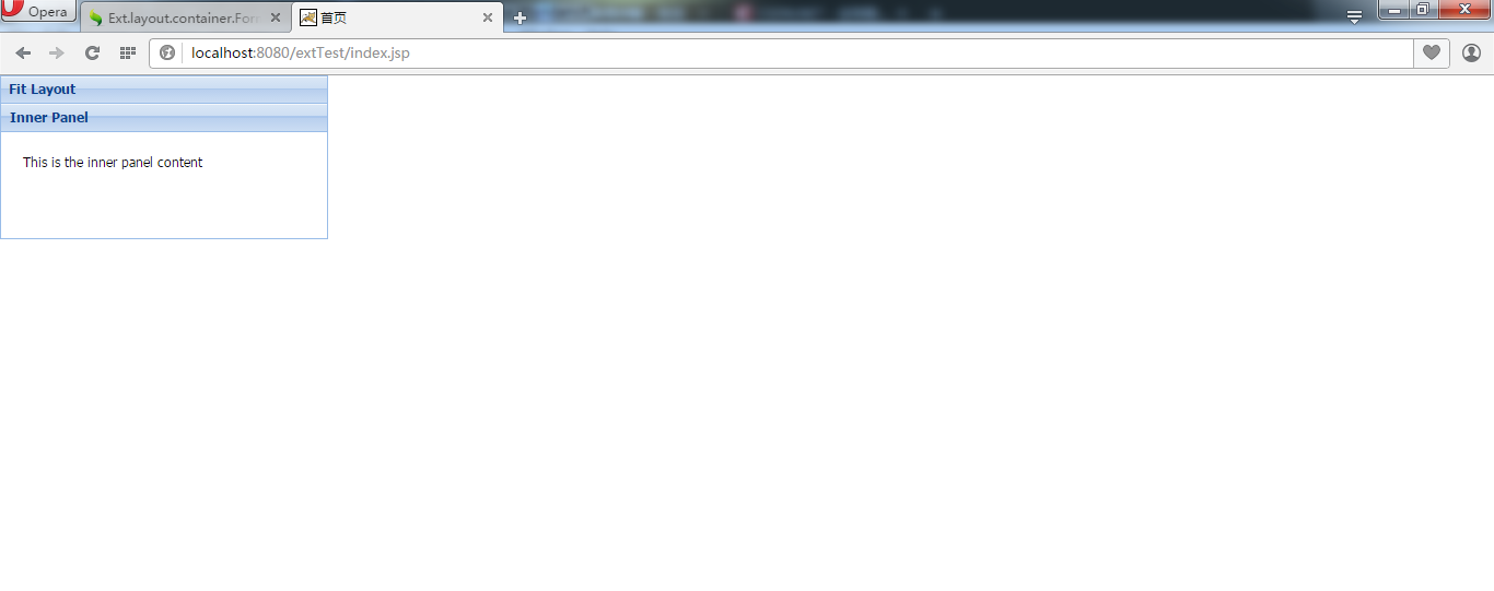
});6.Fit
能使当容器只包含一个子元素时, 子元素自动填满容器
6.1 预览
6.2 代码demo
Ext.onReady(function(){

     Ext.application({
         name:"fit",
         launch:function(){
             //当设置为fit的面板有唯一的子组件时会自动填充满
             Ext.create("Ext.panel.Panel", {
                    title: "Fit Layout",
                    width: 300,
                    height: 150,
                    layout:"fit",
                    items: [{
                        title: "Inner Panel",
                        html: "This is the inner panel content",
                        bodyPadding: 20,
                        border: false
                    }],
                    renderTo: Ext.getBody()
                });

         }

     });

});
6.3关注点
a.如果你想要使用fit实现布局,就应该只给其一个子元素
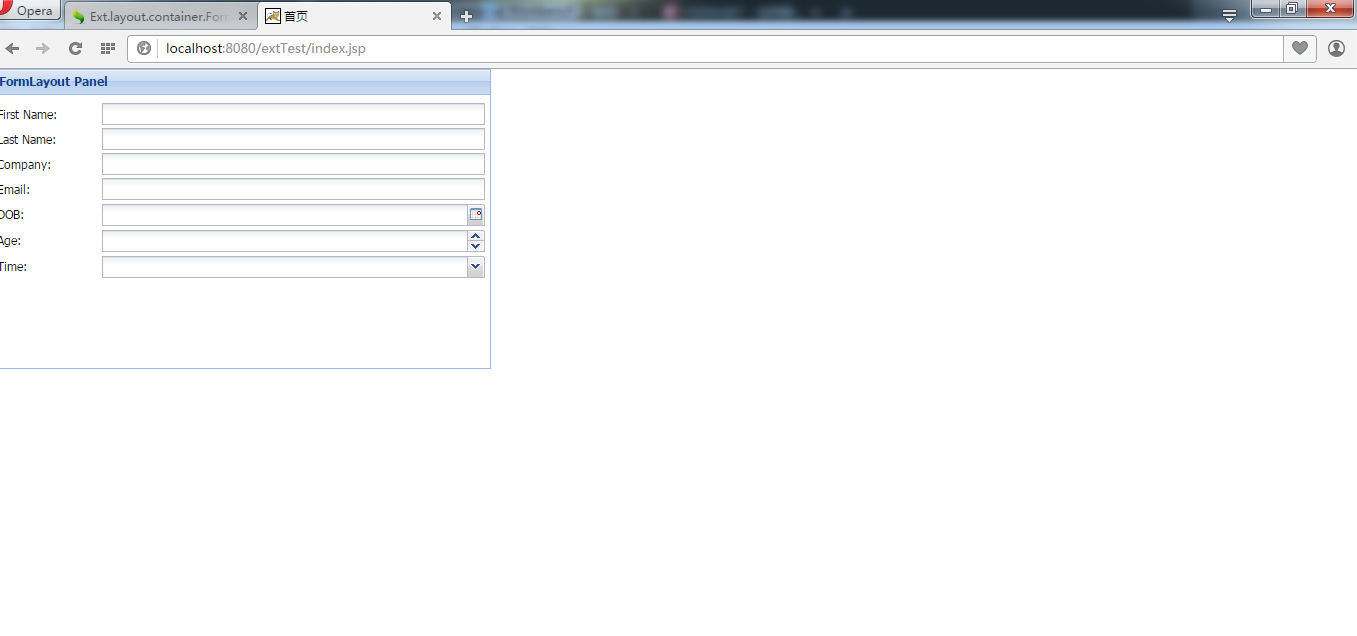
7.form 表单布局
这个布局会将表单中所有的输入框纵向的依次的排列, 且宽度与容器宽度相等.
7.1预览
7.2 代码demo
Ext.onReady(function(){

    Ext.application({
        name:"form",
        launch:function(){
            //表单布局 所有输入框(表单项)纵向依次排列
            //表单项宽度与容器宽度一致

            Ext.create("Ext.Panel", {
                width: 500,
                height: 300,
                title: "FormLayout Panel",
                layout: "form",
                renderTo: Ext.getBody(),
                bodyPadding: 5,
                defaultType: "textfield",
                items: [{
                   fieldLabel: "First Name",
                    name: "first",
                    allowBlank:false
                },{
                    fieldLabel: "Last Name",
                    name: "last"
                },{
                    fieldLabel: "Company",
                    name: "company"
                }, {
                    fieldLabel: "Email",
                    name: "email",
                    vtype:"email"
                }, {
                    fieldLabel: "DOB",
                    name: "dob",
                    xtype: "datefield"
                }, {
                    fieldLabel: "Age",
                    name: "age",
                    xtype: "numberfield",
                    minValue: 0,
                    maxValue: 100
                }, {
                    xtype: "timefield",
                    fieldLabel: "Time",
                    name: "time",
                    minValue: "8:00am",
                    maxValue: "6:00pm"
                }]
            });
        }
    });

});
7.3关注点
a.表单项的宽度与容器一致,所以在Form布局下各子控件的padding属性配置将被忽略
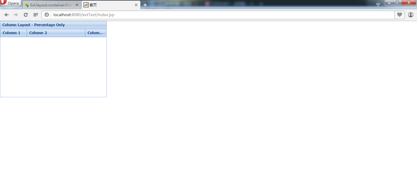
8.column 列布局
这个布局用于在一个多列格式中创建结构化布局的布局样式, 每列可以用百分比或固定的宽度值来定义,
8.1预览
8.2代码demo
Ext.onReady(function(){

    Ext.application({
        name:"column",
        launch:function(){
            //列布局 创建一个多列的布局
            //每列的宽度可以通过百分比定义 所有的和为1
            Ext.create("Ext.panel.Panel", {
                title: "Column Layout - Percentage Only",
                width: 350,
                height: 250,
                layout:"column",
                items: [{
                    title: "Column 1",
                    columnWidth: 0.25
                },{
                    title: "Column 2",
                    columnWidth: 0.55
                },{
                    title: "Column 3",
                    columnWidth: 0.20
                }],
                renderTo: Ext.getBody()
            });
        }
    });

});
8.3 注意
a.每列的宽度可以通过百分比定义 所有的和为1
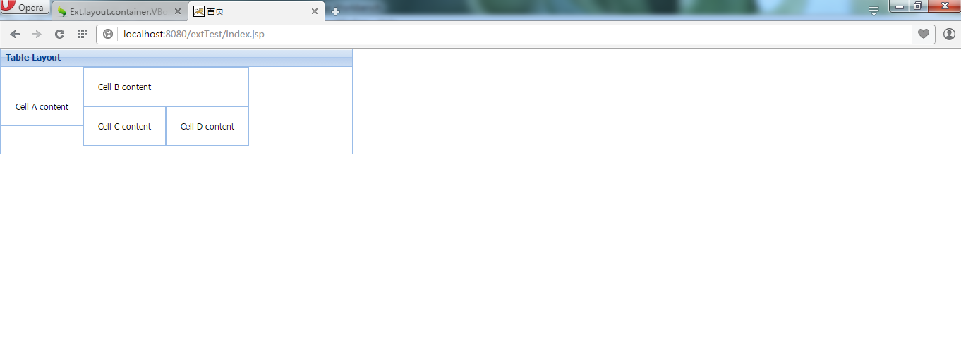
9.table表格布局
通过指定rowspan和colspan来实现复杂布局
9.1预览图
9.2代码demo
Ext.onReady(function(){

    Ext.application({
        name:"column",
        launch:function(){
            //通过指定rowspan和colspan来实现复杂布局
            //指定每部分占据几行几列 会自动按顺序分配
            Ext.create("Ext.panel.Panel", {
                title: "Table Layout",
                width: 500,
                height: 150,
                layout: {
                    type: "table",
                    columns: 3
                },
                defaults: {
                    bodyStyle: "padding:20px"
                },
                items: [{
                    html: "Cell A content",
                    rowspan: 2
                },{
                    html: "Cell B content",
                    colspan: 2
                },{
                    html: "Cell C content",
                    cellCls: "highlight"
                },{
                    html: "Cell D content"
                }],
                renderTo: Ext.getBody()
            });
        }
    });

});
9.3 关注点
a.我们指定每部分占据几行几列,该布局会自动按顺序分配
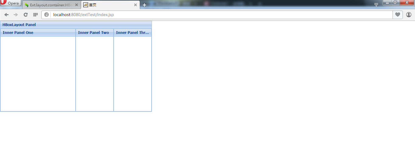
10.Hbox
水平box,所有组件水平依次排列
10.1预览
10.2 代码demo
Ext.onReady(function(){

    Ext.application({
        name:"hbox",
        launch:function(){
            //所有组件水平依次排列
            //根据flax的数值按比例分配
            Ext.create("Ext.Panel", {
                width: 500,
                height: 300,
                title: "HBoxLayout Panel",
                layout: {
                    type: "hbox",
                    align: "stretch"
                },
                renderTo: document.body,
                items: [{
                    xtype: "panel",
                    title: "Inner Panel One",
                    flex: 2
                },{
                    xtype: "panel",
                    title: "Inner Panel Two",
                    flex: 1
                },{
                    xtype: "panel",
                    title: "Inner Panel Three",
                    flex: 1
                }]
            });
        }
    });

});
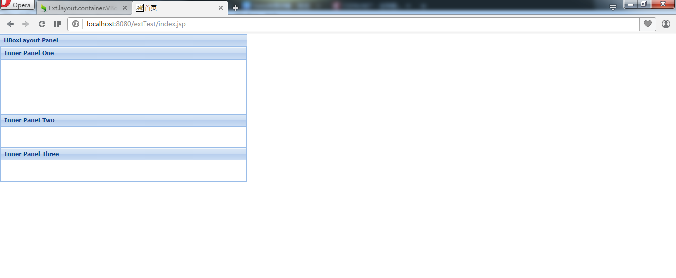
11.Vbox
垂直box,所有组件垂直依次排列
11.1预览
11.2代码demo
Ext.onReady(function(){

    Ext.application({
        name:"hbox",
        launch:function(){
            //所有组件垂直依次排列
            //根据flax的数值按比例分配
            Ext.create("Ext.Panel", {
                width: 500,
                height: 300,
                title: "HBoxLayout Panel",
                layout: {
                    type: "vbox",
                    align: "stretch"
                },
                renderTo: document.body,
                items: [{
                    xtype: "panel",
                    title: "Inner Panel One",
                    flex: 2
                },{
                    xtype: "panel",
                    title: "Inner Panel Two",
                    flex: 1
                },{
                    xtype: "panel",
                    title: "Inner Panel Three",
                    flex: 1
                }]
            });
        }
    });

});
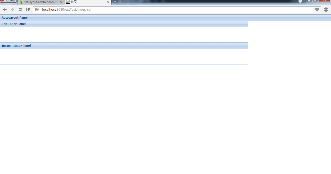
12 auto 默认布局
默认的布局方式,不指定layout时的布局方式
12.1预览
12.2 代码demo
Ext.onReady(function(){
    //默认的布局方式
    //此时写不写layout:"auto" 没区别
     Ext.application({
         name: "auto",
         launch: function () {

             Ext.create("Ext.Panel", {
                    width: "100%",
                    height: "100%",
                    title: "AutoLayout Panel",
                    layout: "auto",
                    renderTo: document.body,
                    items: [{
                        xtype: "panel",
                        title: "Top Inner Panel",
                        width: "75%",
                        height: 90
                    },
                    {
                        xtype: "panel",
                        title: "Bottom Inner Panel",
                        width: "75%",
                        height: 90
                    }]
                });


         }});

});- 上一篇: 巩固java(六)----java中可变参数方法(非常实用哦)
- 下一篇: 文件下载实现